
BRGR for designers
Atomic design
The BRGR design system is based on atomic design principles. This approach helps us understand that the patterns we design are interconnected and hierarchical.
Atomic design helps us design a system of components by breaking down patterns like page templates and complex interactive components into simple forms. We design these simple forms first and then combine them to build more complex patterns.
This creates a consistent user experience by making sure users only have to learn how to use a pattern once, even for complex interactions.
Ions
Ions are a repository to manage the variety of properties that any component can have. Typically, they manifest as SCSS variables. Design tools like Sketch allow us to define ions like font sizes for heading, background colours, and shadows by using text styles and layer styles.
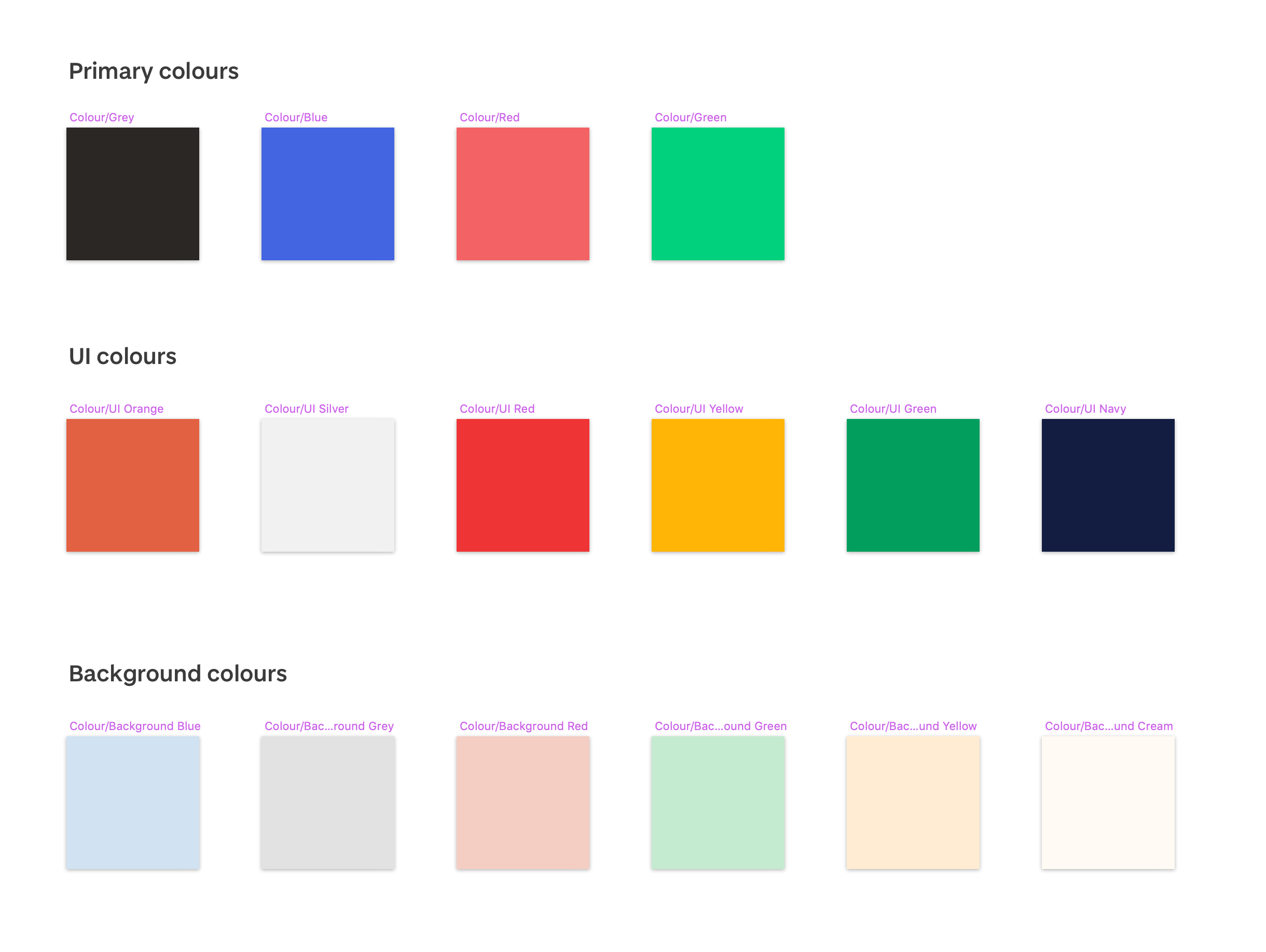
Sketch artboard showing our brand colours
Atoms
Basic HTML elements like form labels, inputs, buttons, and others that can’t be broken down any further without ceasing to be functional.
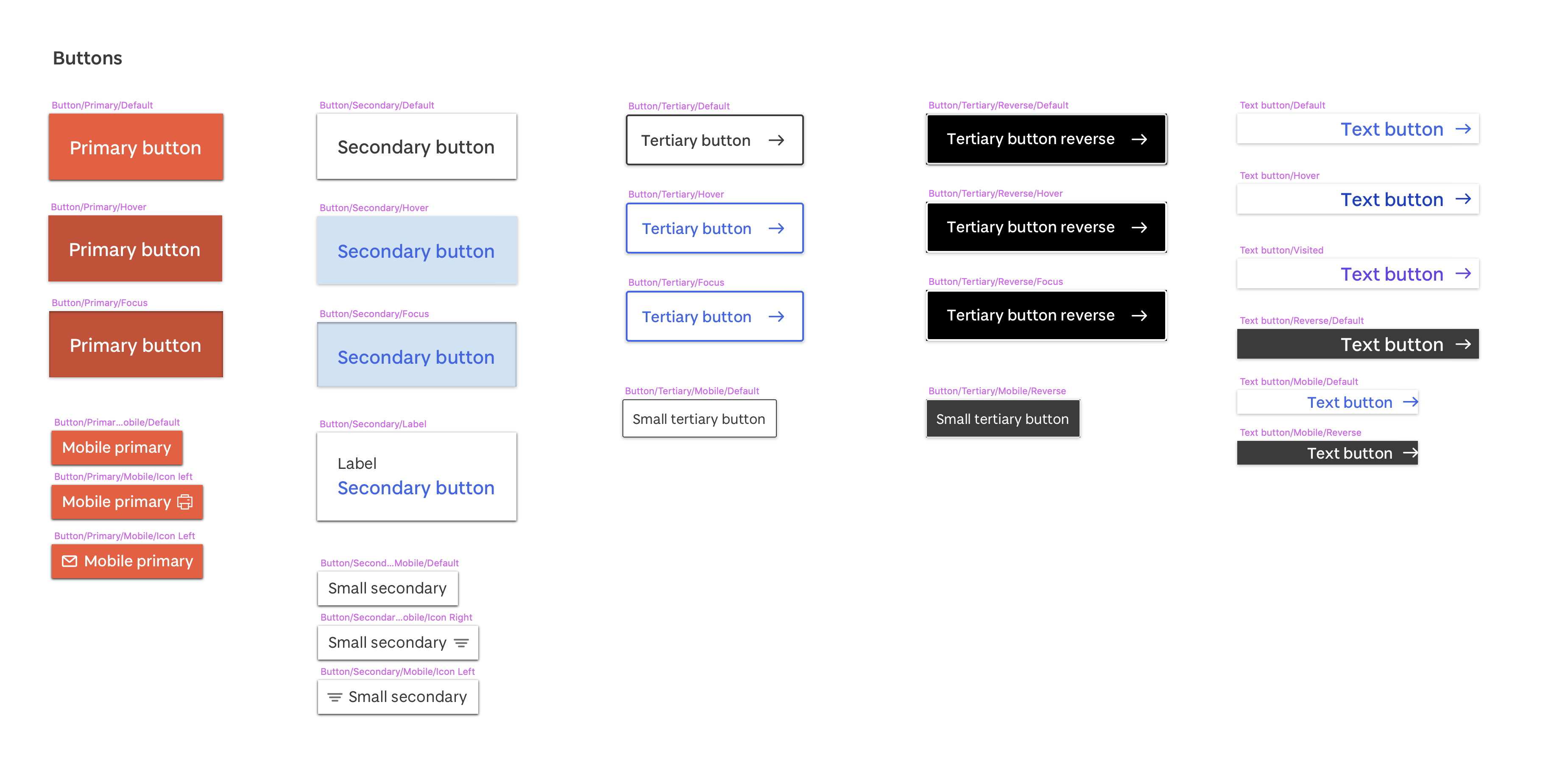
Sketch artboard showing our button atoms
Molecules
Molecules are relatively simple groups of UI elements functioning together as a unit. For example, a form label, search input, and button can join together to create a search form molecule. Modules ‘do one thing and do it well’.
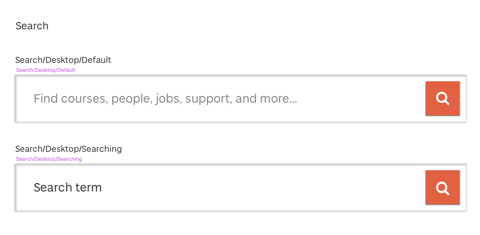
Search molecule component as showin in Sketch
Organisms
Organisms are relatively complex UI components composed of groups of molecules and/or atoms and/or other organisms. These organisms form distinct sections of an interface. For example, a search form molecule is placed into a header organism with a navigation molecule and a logo atom.

Header organism component in Sketch
How to use BRGR
Sketch Library
We have created a Sketch Library for designers who are creating design concepts for the University of Dundee. This includes:
- Text styles (atoms)
- Layer styles (atoms)
- Components (molecules)
- Page templates (organisms)
Using Sketch Libraries
A Sketch Library enables designers to share symbols and styles across documents, and with other designers. When a Sketch Library is updated, everyone using it is notified meaning the shared symbols and styles are always kept in sync.
For information about how to use Sketch Libraries, please refer to the official Sketch documentation
Fonts
This library requires the Baxter Sans typeface. Please also refer to the typography guide.
Baxter Sans font files
The Baxter Sans typeface is licensed to the University of Dundee and has not been made available for public distribution. Please contact us to discuss access to the Baxter Sans font files.
Photography
Photography is a major part of our brand and how we communicate. To ensure high standards and consistency, use only approved photography that meets our photography requirements.
Approved photography is available in our image library.
Access to photography and other media
The photography within our image library and on official University of Dundee website is licensed to the University. If you require access to specific media, please contact us.
Photo treatments
We use gradient maps by blending colours. This helps make our photography more recognisable and ownable.
Image with a subtle treatment

Image with a stronger treatment
These image treatments are not currently available as part of BRGR. If you require the ability to apply these treatments to multiple photos or a one-off application, please contact us
Accessibility
Our mission is to create the same consistent, harmonious experience for everyone. To do this, we need to design accessible patterns, pages, and experiences.
We have a legal requirement to ensure our digital experiences are accessible to everyone. Our aim is to meet WCAG 2.1 compliance.
The following steps are essential when designing for the University of Dundee:
Understand the BRGR accessibility guidance.
This covers important requirements like colour contrast and text legibility
Refer to the University’s accessibility policy and best
practice document
This is a practical guide to navigating the details of creating accessible designs.
Refer to the University’s accessibility policy and best
practice document
This is a practical guide to navigating the details of creating accessible designs.
Download the Stark Sketch plugin
This will help ensure your design meets colour contrast requirements.
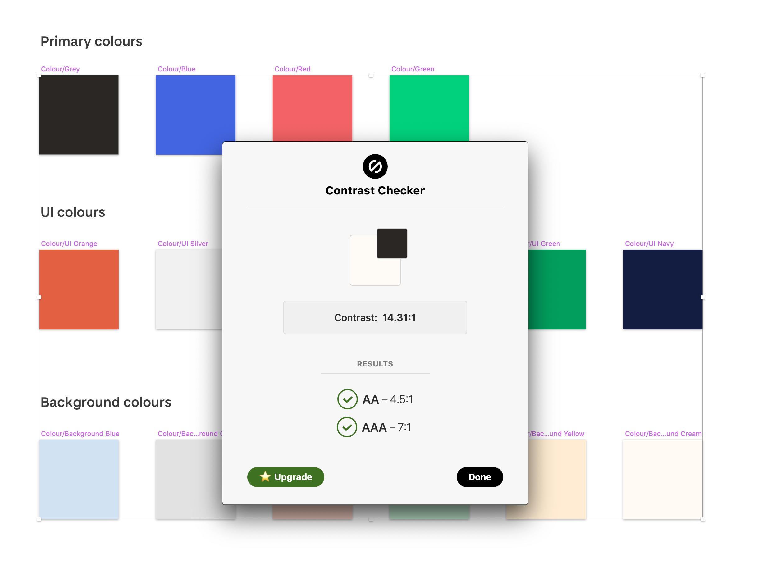
Stark contrast checker showing a pass between two brand colours
Follow up with testing
Ensure your designs are tested once developed using tools like the SiteImprove Accessibility Checker or Google
Lighthouse.
IMAGE OF FUNKIFY EXTENSION HERE
The University of Dundee brand
Designers should ensure they adhere to the University’s brand guidelines. This defines standards for:
- General visual identity principles
- Use of the Baxter Sans font
- Use of photography
- Use of logos
BRGR and the brand
There can be both overlap and differences between our brand guidelines and what we recommend when applying the BRGR design language. For example, the use of colour. BRGR is an approved and recommended application of the brand for digital applications.
If in doubt about a particular application of the brand, please contact us.