
Typography
Text is the main way we communicate on digital platforms. Effective typography ensures our content is easy to read by anyone, on any device. Applying our typography styles consistently results in a positive user experience.
Typography best practice
- Use heavier font weights selectively as overuse of bold fonts can make a page difficult to scan – only bold key information
- Write all headings in sentence case
- Avoid use of multiple level 1 headings on a single page
- Use heading in hierarchical order, for example H1 > H2 > H3 and not H1 > H3
- Use headings and lists to break up long passages of text
- Keep links short and informative – they should help the user understand where the link will take them
- Avoid use of ‘click here’ and similarly vague terms when creating links
- Don’t use the same link text for links going to different destinations (for example, an anchor link to a section called Courses that also contains a link to a page called Courses)
Ions
Typography definitions are available to developers in the form of design tokens called ions.
For example, base font sizes, font stacks, font weights, heading sizes, link states, and lists.
Font
Baxter Sans is our custom typeface. Use this typeface for all text. Helvetica and Arial can be added to a font stack as fallback typefaces.
The typeface currently includes eight fonts in regular, medium, semi-bold, and bold weights with italic versions of each.
Font variations
Font light
Font light italic
Body text font style
Font italic
Font medium
Font medium italic
Font semi bold
Font semi bold italic
Font bold
Font bold italic
Baxter Sans was created for, and is licensed exclusively to, the University of Dundee.
Headings
Four levels of headings are provided. When used in a consistent and semantic way, heading help the user understand the structure of the page by creating a clear hierarchy. It makes a long page of content easier to scan.
Headings usage guide
- Heading 1: Page titles
- Heading 2: Used to define a section of content
- Heading 3: Used to define sub-sections of content
- Heading 4: Used for complex sections of content
Headings with labels
In some pre-defined situations, headings can have text placed above or below them. These act as labels to tell the user something about the content.
Type of content
Page templates include label above the heading telling the user what kind of content is being presented to them. In the main website’s Drupal implementation, only some types of content display this label, for example, guides.
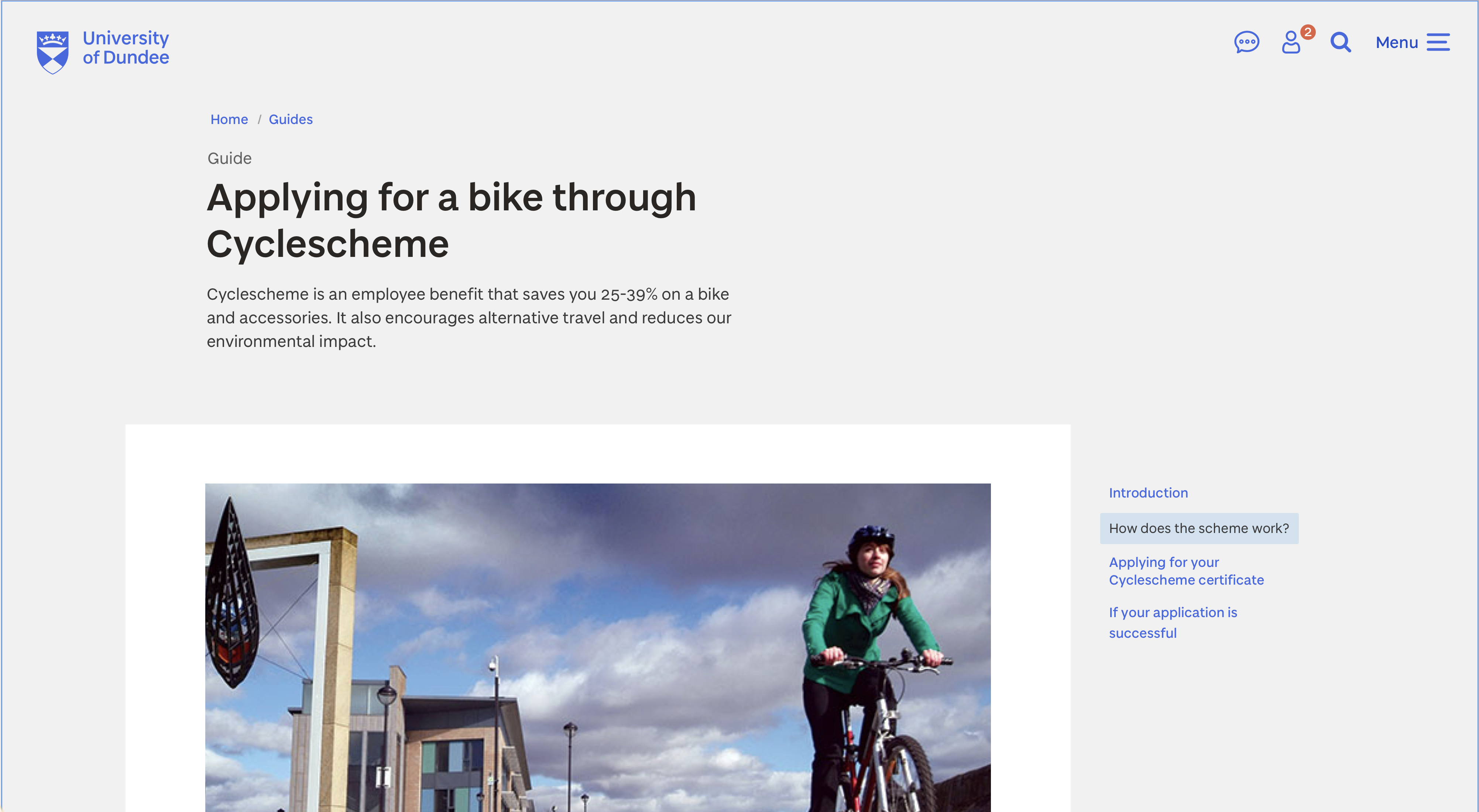
Page template showing the guide content type
Course
The hero component includes a label below the heading to inform the user the school that teaches the course.

Page template making use of the hero component for a course
Paragraphs
The default font size on mobile is 20px and 24px for screens beyond the tablet screen size. Body text uses the Baxter Sans Regular font and the main Grey colour.
You can use the strong element to bold text. This should be used sparingly and only for key information. The same applies for emphasizing text using italics.
Links
Links use a heavier weight of font compared to standard text (Baxter Sans Medium). Links on a light background use the core Blue colour. Links on a dark background or photo are white.
Styles have been created for link states. For example, visited links use a standard browser colour (dark purple on light backgrounds and light purple on dark backgrounds and photos).
We are currently not using underline styles on links – this is under review as part of ongoing accessibility testing.
Lists
Both bulleted and numbered list styles are available. Lists use font sizes and colours consistent with body text.
The Link list component is available for presenting a list of linked text without bullets. This is used mainly within other navigation-based components.
Usage guide for lists
- Use bulleted lists to break up long passages of text
- Use numbered lists for sequential information, such as steps in a process
- Use link lists when linking to multiple related pages